In the world of data visualization, barchart stand out as one of the most effective and widely used graphical representations. Whether you’re a student, a business professional, or a researcher, understanding how to create and interpret barcharts can significantly enhance your ability to present and analyze data. This article explores the key aspects of barcharts, their benefits, types, best practices for creating them, and real-world applications.
What is a Barchart?
A barchart is a visual representation of data that uses rectangular bars to show the values of different categories. Each bar’s length or height is proportional to the value it represents, making it easy to compare quantities across different groups. Barcharts can be displayed either vertically or horizontally, depending on the preference of the user and the nature of the data.
Components of a Barchart
- Axes: Barcharts have two axes—typically, the horizontal axis (x-axis) represents the categories being compared, while the vertical axis (y-axis) shows the values or frequencies of those categories.
- Bars: Each category is represented by a bar, which can vary in length or height according to the value it represents. The space between the bars can also be adjusted to enhance clarity.
- Labels: Labels are used to identify the categories on the axes and often provide additional context about the data, such as units of measurement.
- Legend: If a barchart includes multiple datasets or categories, a legend helps differentiate between them, often using different colors or patterns for each bar.
Types of Barcharts
Barcharts come in various types, each serving different purposes and suited for specific kinds of data representation:
- Vertical Barcharts: The most common type, where bars extend vertically from the x-axis. They are ideal for displaying categorical data and comparing values across different categories.
- Horizontal Barcharts: Here, bars extend horizontally from the y-axis. They are particularly useful when category names are long or when there are many categories, as they can improve readability.
- Stacked Barcharts: These charts display multiple datasets on top of each other within a single bar. This allows for a comparison of the total and individual category contributions to the whole.
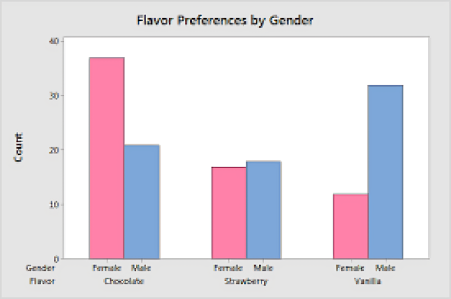
- Grouped Barcharts: Also known as clustered barcharts, these display multiple bars for each category, allowing for direct comparison of subcategories across different groups.
- 3D Barcharts: These add depth to the standard barchart by rendering the bars in three dimensions. While visually appealing, they can sometimes make interpretation more complex and are often discouraged in favor of simpler designs.
Benefits of Using Barcharts
Barcharts offer several advantages, making them a popular choice for data visualization:
- Ease of Interpretation: Barcharts provide a straightforward way to compare data. Viewers can quickly see which categories have higher or lower values, making data interpretation intuitive.
- Versatility: Barcharts can be used across various fields, from business and marketing to education and healthcare, to represent numerous types of data.
- Visual Impact: A well-designed barchart can attract attention and effectively communicate key messages, making it easier to persuade an audience or convey critical information.
- Flexibility: Barcharts can easily accommodate different data types, such as nominal, ordinal, interval, and ratio data, making them a versatile tool for data presentation.
- Comparison of Multiple Categories: Barcharts can effectively show comparisons across different categories and datasets, helping to identify trends and patterns.
Best Practices for Creating Effective Barcharts
To maximize the impact of your barchart, consider the following best practices:
- Choose the Right Type: Select the barchart type that best represents your data. For instance, use a stacked barchart for showing part-to-whole relationships, while a grouped barchart is more suitable for comparing multiple groups.
- Limit the Number of Categories: Too many bars can clutter a barchart and confuse the viewer. Aim for a manageable number of categories—ideally, no more than seven to ten.
- Use Consistent Scales: Ensure that your axes have consistent and appropriate scales. Avoid manipulating scales to exaggerate differences, as this can mislead your audience.
- Incorporate Clear Labels: Use clear, concise labels for your axes, bars, and legend. Ensure that all text is legible and adequately sized for easy reading.
- Maintain Color Contrast: Use colors that contrast well to differentiate between bars and categories. This not only aids in clarity but also helps in distinguishing between multiple datasets.
- Add Data Values: Including the actual values on or above the bars can enhance clarity, especially when the differences between values are subtle.
- Provide Context: Offer a descriptive title and necessary context in the form of a subtitle or footnote to help your audience understand what the data represents.
- Avoid 3D Effects: Unless necessary, avoid 3D barcharts. They can distort perception and make it harder for viewers to interpret the data accurately.
Real-World Applications of Barcharts
Barcharts find applications across various sectors, showcasing their versatility:
- Business: Companies often use barcharts to present sales data, compare product performance, or analyze customer feedback. For instance, a barchart can illustrate the monthly sales figures of different products, allowing stakeholders to assess which items are performing best.
- Education: In academic settings, barcharts are utilized to compare test scores, track student performance over time, or analyze survey results. Teachers can use them to present data on class participation or demographics.
- Healthcare: Healthcare professionals may employ barcharts to visualize patient data, such as the prevalence of certain diseases in different populations or the effectiveness of treatment options.
- Marketing: Marketers use barcharts to analyze consumer preferences, track campaign performance, and compare the effectiveness of different advertising strategies. For example, a barchart can highlight customer satisfaction scores across different service touchpoints.
- Government: Government agencies often utilize barcharts in reports to convey statistical data related to demographics, economic performance, or public health trends. They help in making complex data more accessible to the public.
Tools for Creating Barcharts
Several software tools and platforms allow users to create barcharts easily:
- Microsoft Excel: A widely used spreadsheet application that includes built-in features for creating various types of barcharts. It allows users to input data, customize chart elements, and easily adjust formats.
- Google Sheets: Similar to Excel, Google Sheets provides an online platform for creating barcharts. Users can collaborate in real time, making it ideal for team projects.
- Tableau: A powerful data visualization tool that enables users to create interactive and dynamic barcharts. Tableau is particularly useful for handling large datasets and providing insightful visual analyses.
- R and Python: These programming languages offer packages (like ggplot2 for R and Matplotlib for Python) that allow for highly customizable barchart creation. They are particularly popular among data scientists and analysts.
- Online Chart Makers: Various online tools, such as Canva and Infogram, provide user-friendly interfaces for designing barcharts without needing advanced software skills. These tools often include templates and design options for professional presentations.
Conclusion
Barchart are a fundamental tool in data visualization, offering a clear and effective means of comparing and presenting data across various fields. By understanding their components, types, benefits, and best practices, you can leverage barcharts to enhance your data storytelling and analysis. Whether you’re creating a simple report, a business presentation, or conducting research, mastering the art of barcharts can significantly improve your communication and data interpretation skills. Start experimenting with barcharts today and unlock the power of effective data visualization!